


After all my research i started drawing ideas for my type in pencil. Starting with similar pictures to what i saw in the books and on the internet, then shaped them into letters.


Dutch designer Jelte van Abbema won a competition in 2009 with his design print using bacteria in petri dishes called “Symbiosis”. He photographed the bacteria through many stages, from growth to death. This resulted in the letters changing shape and colour as the bacteria grew. Starting with the dark blue then moving to amber. I really enjoy the sans serif font he chose for the experiment, using simple shapes to create the letters and how they are photographed is nice as all of the letters look uniform in the circle of the petri dish outline.


“A promising marriage between art and science, based on in-depth research. This technical invention creates new images and forms.”
Similar to Abbema, Ori Elisar, a Jerusalem based designer created a typeface that made use of petri-dish to create letterforms in hebrew for his “Living language” project in 2015. Similar to mine, he stated in the interview that it will not be a completely functional typeface. Elisar sees it as an “alternative to typography’s occasional perception as the most dry and boring field of design”. Basically a bit of fun.
“Using my research, experiments and results, I am hoping to question nature, culture, character and language with some new theories of my own,”


I really like the idea behind this using ink and natural bacteria to create the typeface, however as previously stated i dont think it is very easy to use in practice, but the idea behind it is great.
I started looking at science books which contained line drawings of microscopic organisms which helped me to get an idea of the shapes my letters will need to be, mainly squiggly lines and have a nucleus, I am going to incorporate these into my letter designs. I love the way that there are so many shapes that can be easily turned into letter formations.
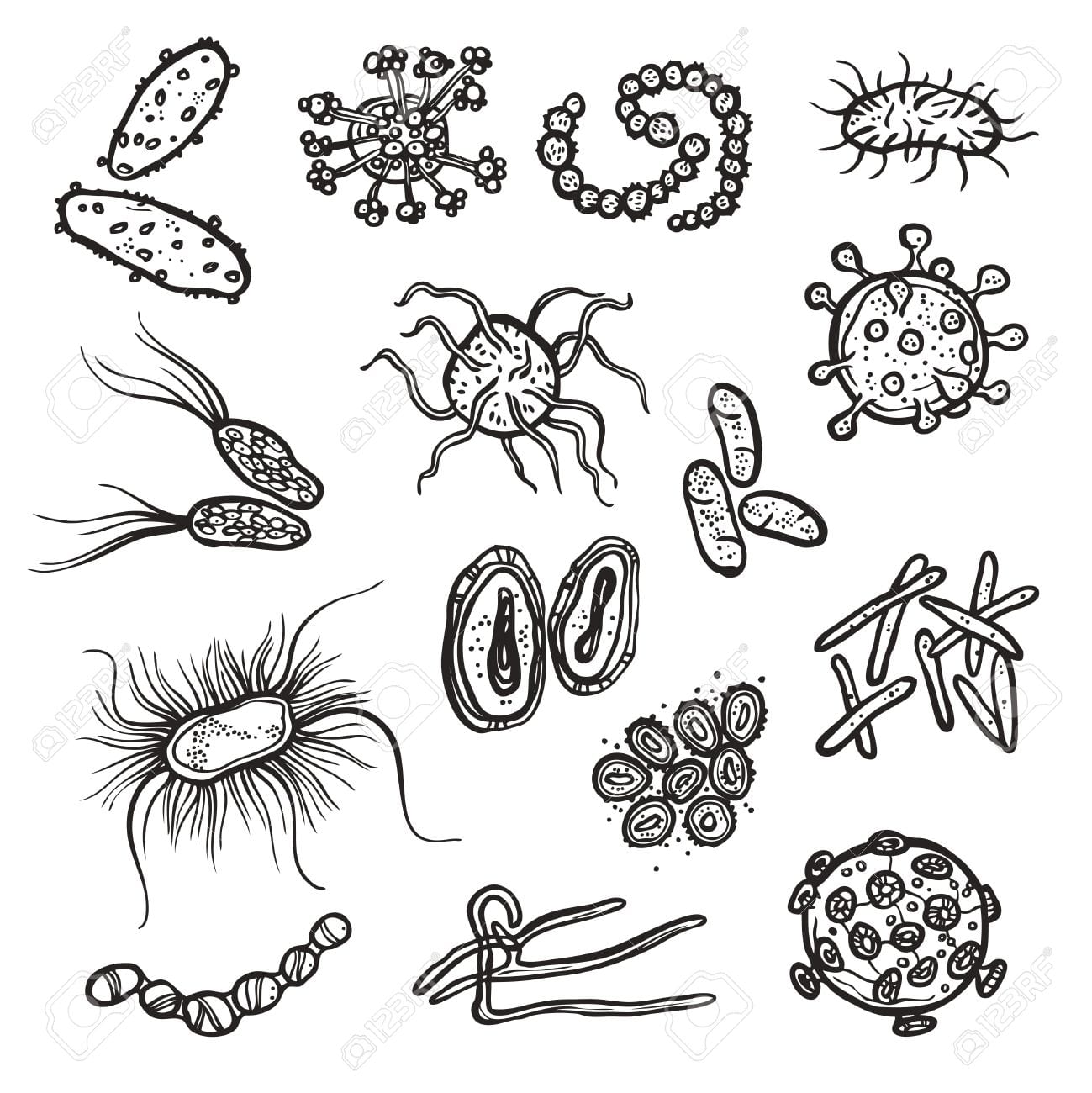
These line drawings inspired me to draw my own letters using ink pens, then scan those drawings in to the computer and add them to the poster I will create. I feel like drawing the letters instead of doing them digitally will give a better end result as I could easily control the lines, and I didn’t want it to be too perfect, as it would look unrealistic.
I started by looked around on the internet for existing typographies on the same theme as mine and they were very interesting however none like what I want for my project, this is good because it shows that it is an original idea however I can use the existing ones for a base for ideas.

(http://creativepro.com/wp-content/uploads/sites/default/files/story_images_2/20121102_rus3.jpg)
I really like the way that the type on this poster uses wavey lines coming off of the letters so that they look tenticle-like which is seen on a lot of bacteria. It also gives the sense of repulsion that I get when i think about germs (call me a germaphobe).